Web design trends is changing rapidly, and designers can face quite a lot of difficulty to stay on top of the wave of new and modern web design trends.
Nearly 95% of a visitor’s first impression of your organization is determined by a unique web design trend, and good design can help you increase sales.
Think of the previous websites that you have visited. How many of those have created a lasting impact on you? How many of them were easy to use and had clear call to actions?
Users enjoy visiting websites that have a user friendly interface and an appealing layout. That is where web design trends come in.
As a result, incorporating modern web design trends into your marketing strategy is more crucial than ever.
But what new web design trends can you expect in 2021, and how can you use them to spruce up your site? Follow to get more inspirations and emerging insights.
Because they are grounded in technology, each year’s web design trends promise to transport us to the scifi future of our fantasies. However, the projections we received from our global community of web designers for 2021 imply the contrary.
Web designers in 2021 appear to be striving for new heights of realism rather than hi-tech fantasy. They’re fusing the digital and the mundane like never before, demonstrating how pervasive websites have become in our daily lives.
Modern website design, like print publications, is returning to minimalism with a flood of deliberate white space.
White space, like natural currents, aids in the movement of visitors through your website pages, flowing from one piece to the next — and it creates a visual hierarchy in which no element detracts from the overall picture.
White Space
The white space provides viewers with breathing area, allowing their eyes to rest. By outlining relationships between page elements, it also enhances comprehension.
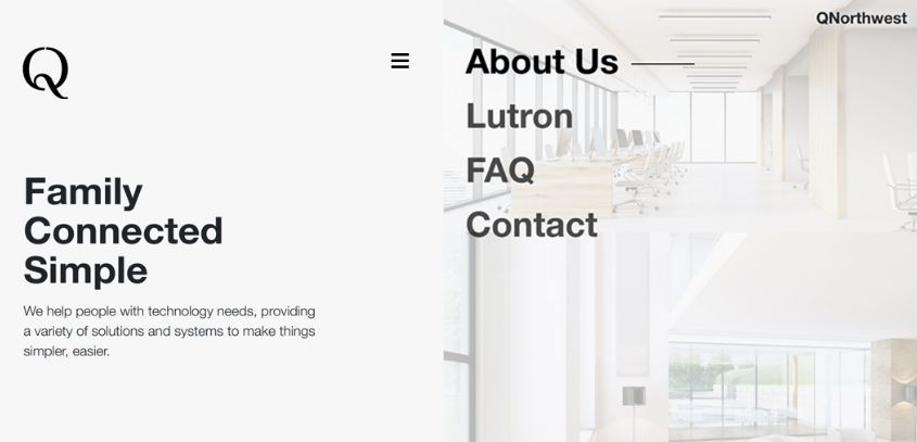
Human eyes perceive two elements as one unit when they are close together with little white space between them. If two parts are further away, on the other hand, your eyes will see them independently.
The use of white space allows visitors to recognize the hierarchy of your website.
They also use white space on pages to identify the most important information, thus understanding how to employ white space on your website will assist improve the user experience (UX).
Retro Fonts
Many old things have been cool again, only to become even more uncool again. Consider mustaches on the handlebars and mom jeans. Irony has a finite lifespan.
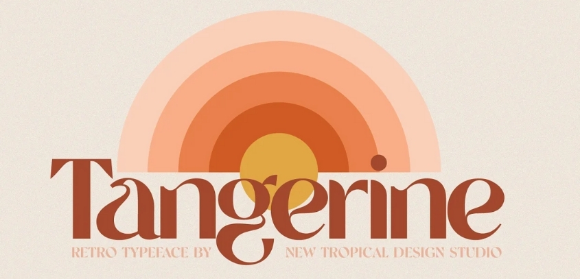
Retro fonts have gone through the same ups and downs in popularity, and many designs with antique typography haven’t held up well over time.
Throwback typography, on the other hand, is experiencing a resurgence. We aren’t seeing the same old fonts anymore. Stylization and a dash of artistry, on the other hand, are redefining what vintage fonts can be.
On the page for Spotify’s Carnival promotion, we see this blending of old and new. Instead of feeling outdated and cliché, they experiment with conventional bold typefaces to give them fresh life.
Full Page Headers
In 2021, full-page headers will be the way to go for modern web design.
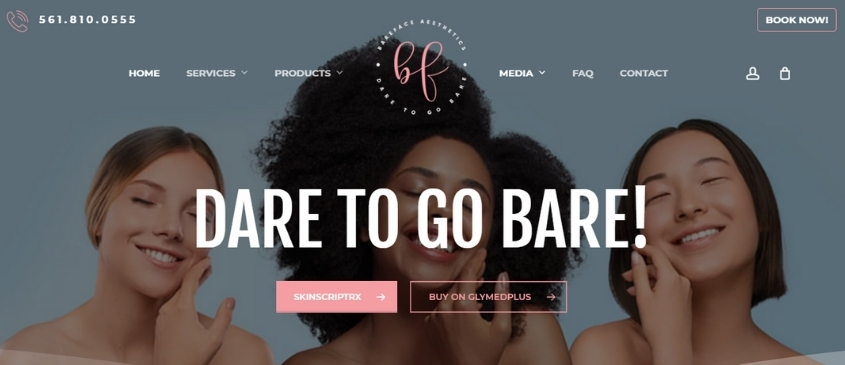
Web designers can use a variety of header layouts, but one frequent option is to place critical text or call-to-action (CTA) buttons on the left side of the header and eye-catching graphics on the right.
This is due to the fact that readers’ eyes are drawn to the top-left corner of your page.
Parallax Effects
For years, parallax scroll effects have been popular in website design, and we expect to see more subtle and innovative explorations of what can be done with parallax in 2021.
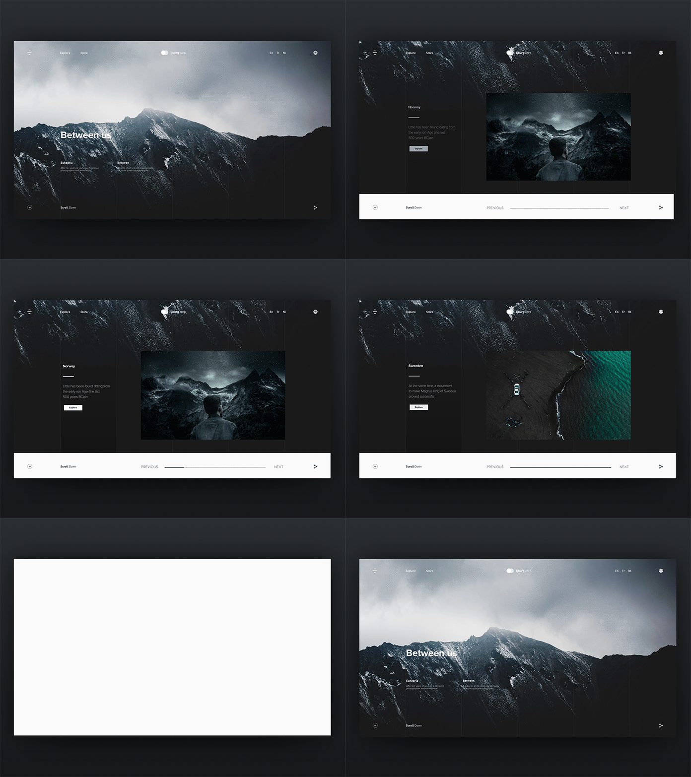
It’s important to remember that too much movement in parallax effects can be dangerous for persons with vestibular issues, as the sense of depth and movement can create disorientation.
Here are some rules that we’re seeing more designers follow to ensure that parallax is used sparingly and without causing harm:
- Allowing parallax effects to distract from crucial information is not a good idea.
- Make it as easy as possible for the user to execute a critical task.
- Reduce the quantity of parallax effects as much as possible.
- Within each instance, reduce the amount of parallax movement.
- Limiting parallax effects to a specific portion of the screen
- Allow users to turn off parallax effects if desired.
- Horizontal scrolling
- Horizontal scrolling, once considered a web design faux pas, is making a comeback.
Horizontal Scrolling
More and more site designers are experimenting with horizontal scrolling. Those that do it best deviate from the norm not for the sake of being unique, but as a practical approach to gradually reveal secondary information, such as in an image gallery.
In order to use horizontal scroll successfully in 2021, designers will keep the following in mind:
Allow various means to navigate, such as arrow buttons with clear labels, rather than forcing visitors to scroll across horizontal text.
Use obvious visual clues to show where horizontal scrolling is used in your content, and don’t disguise these indicators behind hovers.
Consider what material would benefit from a horizontal scroll – a photo gallery is a nice example, since a horizontal scroll would show readers a tiny preview and give them the option to view more or continue scrolling down the page.
When reading content, don’t make it necessary to scroll horizontally.
Playful Cursors
Cursors are common on modern websites, making page viewing an entirely new experience.
In 2021, adding entertaining cursors to your website can be as simple as altering the cursor shape or as difficult as writing cursor-triggered animations. In any case, your visitors will enjoy interacting with unique cursors.
3D Visuals
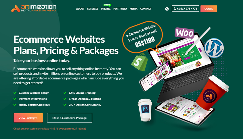
With the introduction of higher-resolution screens, 3D design has progressed significantly beyond Geocities’ blocky and beveled edges. We’ve seen high-quality 3D images easily integrated into online designs. Rather than being distracting, they enhance the entire user experience.
Chat Bots Become Human Live
Another feature that has been popular for a few years and will be significant in 2021 is chatbots.
We expect chat bots to become the standard for simple customer service queries and “personal shopping” as artificial intelligence and machine learning become more powerful.
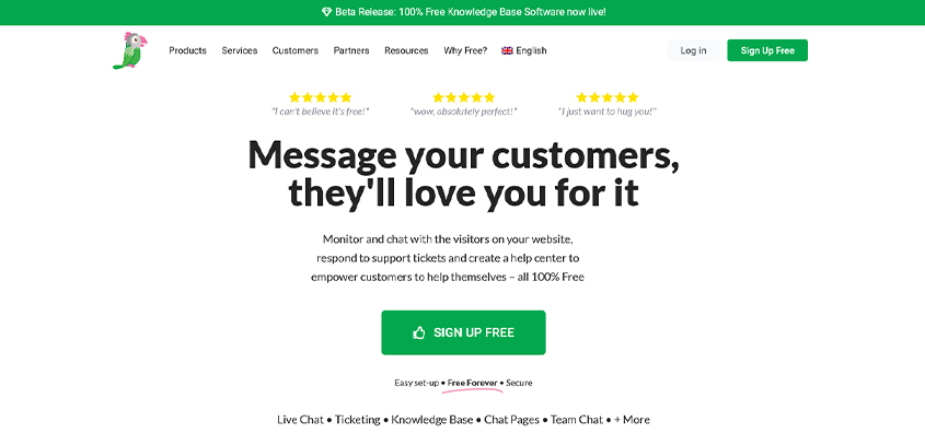
For example, if a consumer comes to your website looking for phone help and the chat bot notices that a free phone upgrade is available, the customer will be notified.
The chat bot can inform them of the upgrading. This can provide a great customer experience while also saving the company money on customer service costs connected with speaking with a live person.
Voice Activated Interface
We no longer type into Google to obtain information; instead, we pose a query or make a demand. As a result, web design is evolving to accommodate the growing popularity of voice chatbots and virtual assistants. While voice-activated interfaces aren’t yet ubiquitous on most websites, this burgeoning trend isn’t going away anytime soon.
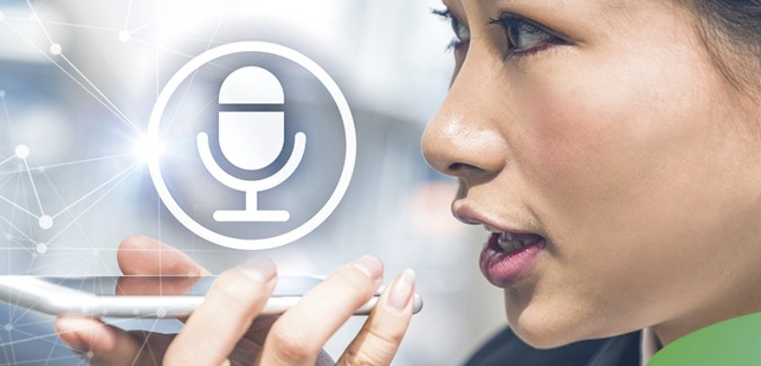
We should anticipate to see an increase in the number of websites that offer voice search as an alternative to regular text search.
Inclusivity and Accessibility
Inclusivity and accessibility are more than a fad, but online design must increasingly consider the requirements of individuals with impairments. Having a site that all visitors can navigate and interact with is more than just part of offering exceptional customer service and an excellent experience. It can help you increase conversions, improve your SEO, and reach a larger audience.
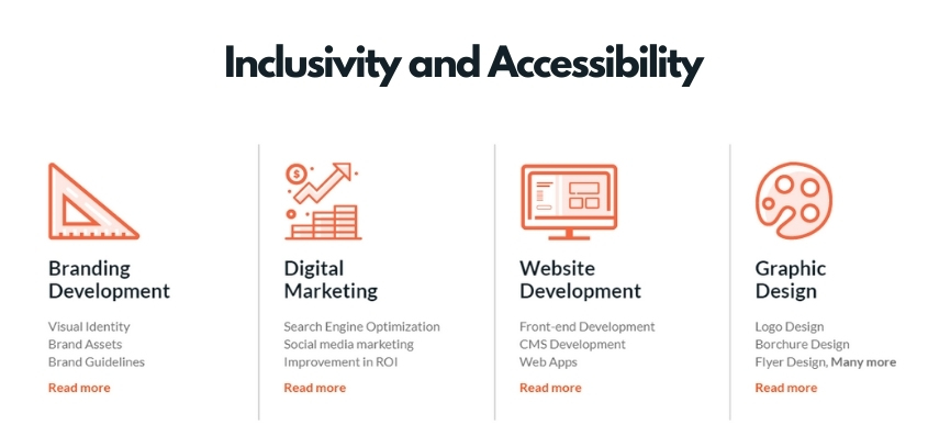
- Creating a significant color contrast between text and backgrounds is one element that improves accessibility.
- Adding focus indications, such as the rectangular outline that appears around links when keyboard navigation is used;
- Instead of low-context placeholder text, use labels and instructions with form fields.
Multimedia Experiences
Multimedia web experiences are cropping up everywhere now that the majority of consumers have access to better internet speeds. A rich user experience is created by combining graphics, text, video, and audio.
In 2021, successful designs will combine constraint and multimedia experiences:
- When mixing motion and audio, simplicity is preferred. For persons with cognitive problems, having too much going on might be distracting or stressful.
- To make content more accessible, consider using a variety of media types.
- Closed captions and transcripts should be included for all pre-recorded multimedia.
- Include alt text for photos and longer descriptive text with complicated images.
- Make sure all text is written in HTML rather than being rendered inside pictures.
- Instead of auto playing video or motion material, give the user a clear “play” button that allows them to play and pause the content.
It is a responsibility to handle a multitude of variables while using multimedia successfully and accessibility. More video accessibility materials can be found here.
Custom Illustrations
Illustrations bring your brand and website to life.
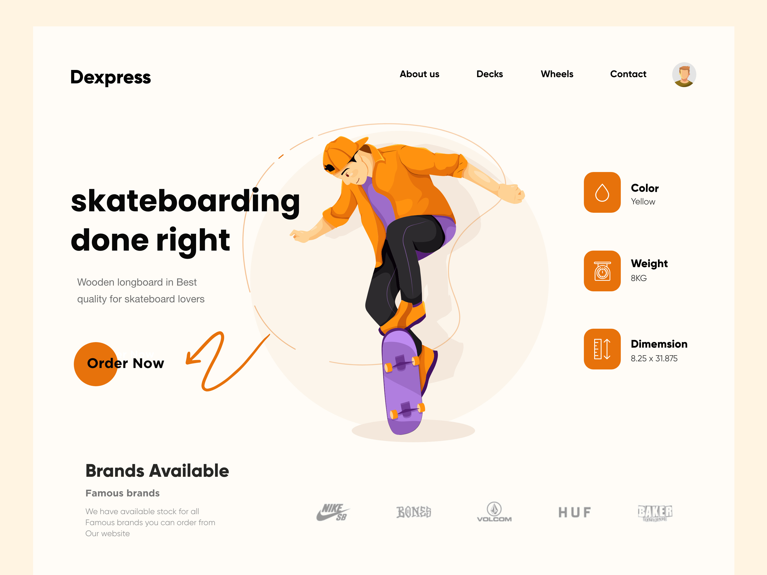
Modern web design for 2021 takes inspiration from print publication and other traditional art mediums when it comes to illustrations.
In 2021, websites will incorporate unique graphics into their current online design, putting an end to the days of cookie-cutter stock images.
Color Trends In 2021
Color palettes are explored in modern website design, and each year a new trendy color for the web emerges. It was blue in 2019, and mint in 2020. A.I. Aqua, a tech-inspired hue of blue, has been named the color of the year for 2021 by trend predicting companies WGSN and Coloro.
Venngage believes that in 2021, online color palettes will become more subdued.
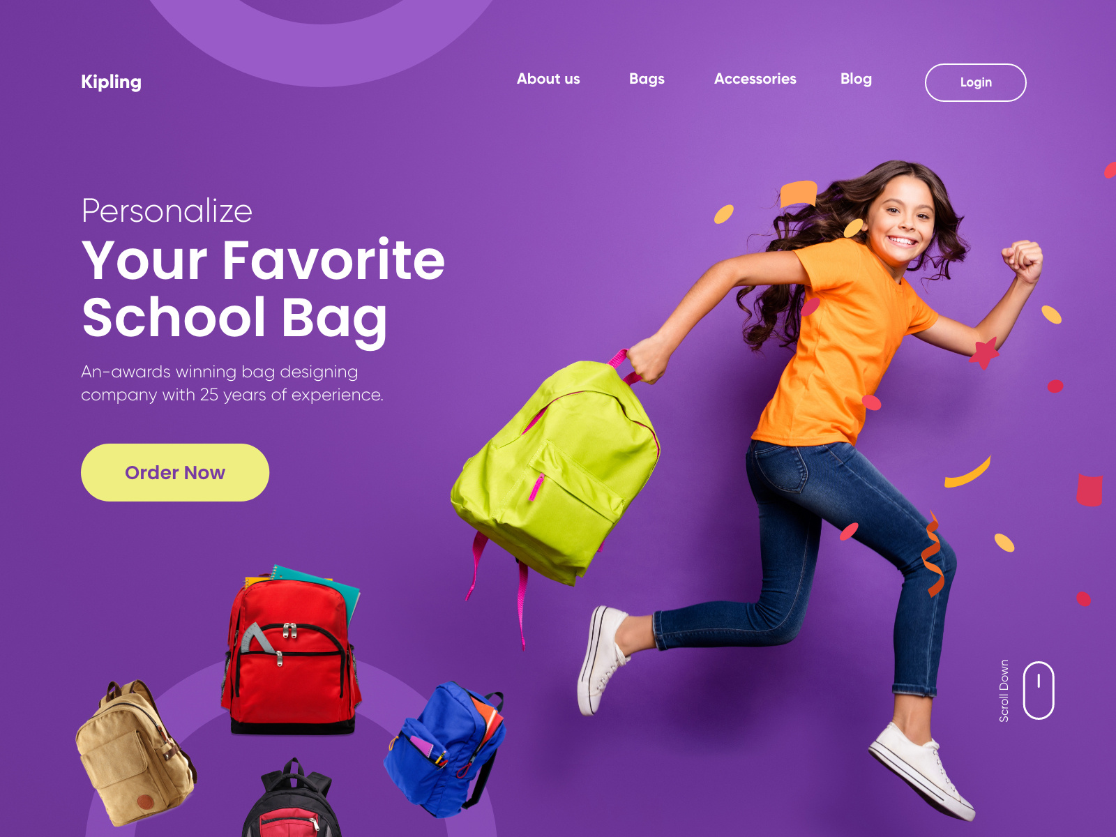
Gradients are a trend that will certainly continue into 2021, and designers will likely continue to push the boundaries of design with gradients. Gradients are also ideal for reaching a wide audience because they encompass a variety of colors.
Color psychology will also play a big part in web design trends in 2021. Before creating a new color palette for your firm, be sure you understand color psychology. It’s critical that your colors complement your brand.
From 2020 through 2021, certain minor color trends in web design are expected to persist. It appears that:
- Information and backdrops = soft, cool colors (blues, teals, and greys).
- Calls to action = bright, warm hues (reds, oranges, even greens) (CTAs)
Designs Based on Preference
Web development has progressed significantly in terms of providing more personalized experiences.
This can range from incorporating a dark/light mode toggle and other options to change a site’s design and navigation to providing material that is custom-tailored to one’s preferences, such as Spotify’s personalized playlists.
The internet is becoming less of a passive user experience and more user-centered thanks to new design techniques and algorithms.
The future will place even greater emphasis on addressing the requirements, interests, and preferences of those who use websites.
Neumorphism
This year, neumorphism has exploded in popularity, and in 2021, it will guide us into the paradoxical age of minimalist reality.

The style is a descendant of skeuomophism, a design approach that integrates reconstructions of old, outmoded materials into current designs, and it was popular in the early 2010s on app icons everywhere.
Flat design, which reduced symbols and colors in a style that was less realistic but more uniform and easily recognizable, generally replaced this approach.
Neumorphism is a fusion of the two approaches, with designs that use selective drop shadows to resemble physicality while being layered with semi-flat colors.
The effect is most usually compared to digital embossing or debossing.
It allows designers to recover the tactile feel that was lost during the flat design era, which in turn strengthens the user’s bond with the design.
This stylistic realism will be seen on buttons, search bars, and text boxes across the digital designs of 2021.
Abstract Art Composition
Abstract shapes, particularly those made up of geometric primitives such as squares and circles, might appear plain, minimalist, and confining.
Web designers, on the other hand, are combining them into big, sweeping designs that exude freedom in the year 2021.
In most situations, stock photographs and figure illustrations are being replaced with abstract art groupings.
They can feature images of humans, but even without them, they elicit emotion.
Their exploding, Pollock-esque compositions have an energizing quality to them, and their numerous brilliant hues are contagious.
Even in the absence of familiar human faces, the outcome is online sites that feel expressive and alive.
Web Design for Causes
The internet has become a safe haven as a result of the COVID-19 epidemic and the subsequent shelter-in-place orders that have followed.
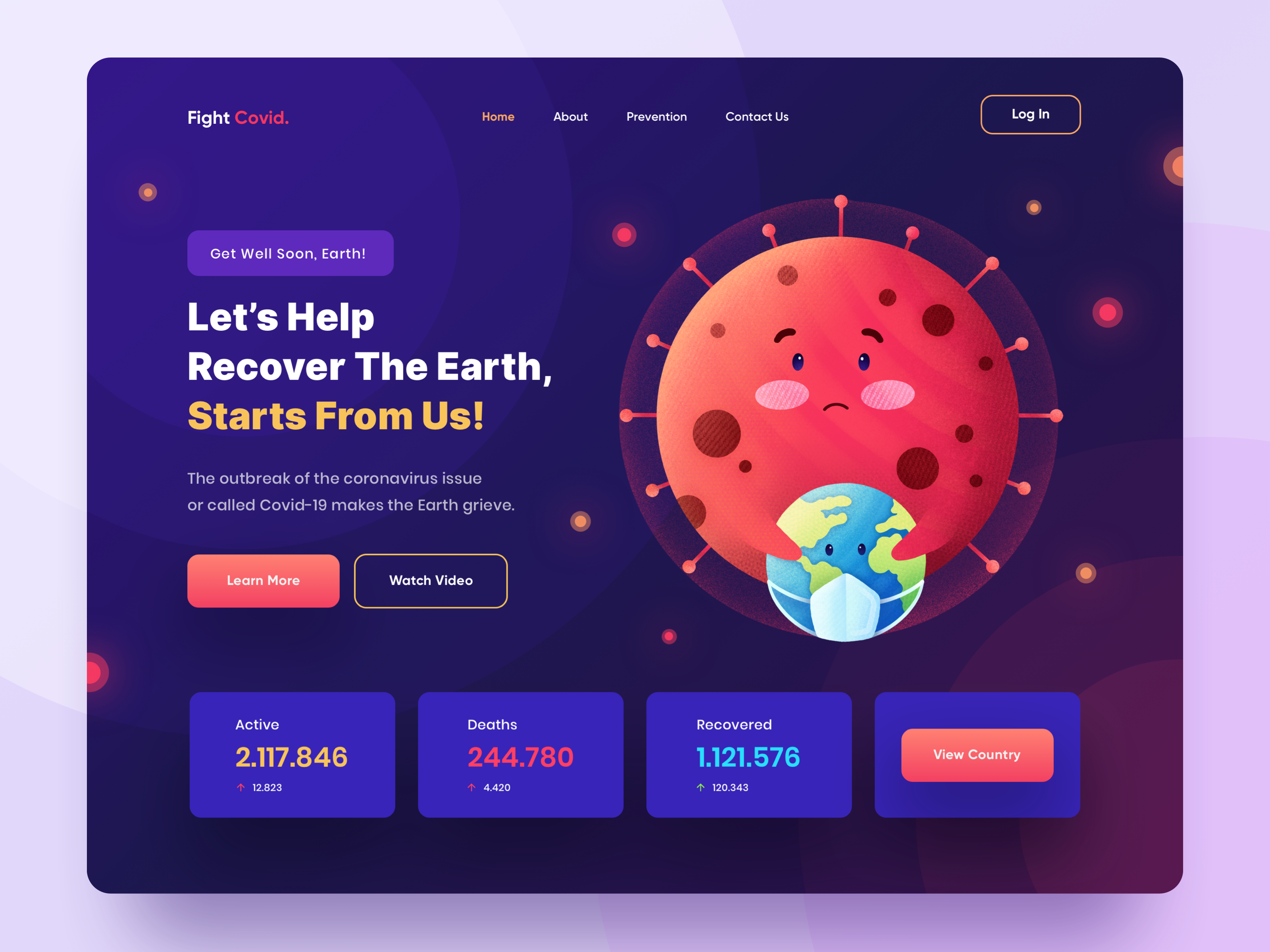
Virtual conferences have become the norm for social gatherings and entertainment, and many brick-and-mortar businesses have turned to the internet to stay viable.
And web designers were up to the task, developing designs that were both profound and impactful.
Web designers will continue to recognize their role in assisting the globe through difficult times in 2021.
This means that brands will build their websites to highlight their strengths, such as their environmental efforts or community involvement.
It entails a surge in digital venues that use interactive tools like visualizations and simulations to raise awareness about social issues. It also means more DIY web design resources and methodologies, making website creation more accessible to everyone.
The goal of web design has traditionally been to provide excellent user experiences. The ideal user experience in 2021 will be based on shared values and common causes.
Three Dimensional Colors
Color schemes have been popular in web design for a while, and this year’s trend feels like the next step forward, with color transitions that are more lifelike than ever.
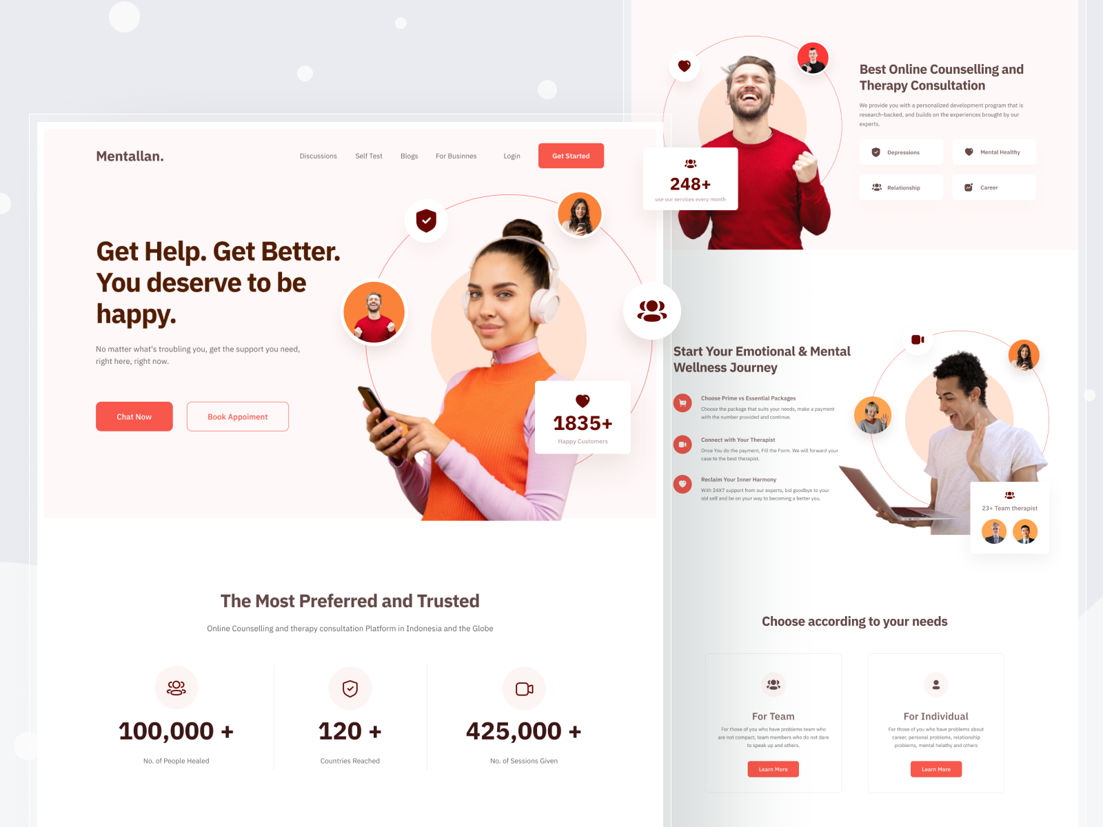
We should expect colors that are vivid and three-dimensional, almost like fruit you can pluck right off of the screen, based on Apple’s Big Sur OS.
This style is achieved through fine shading, which gives the flat icons of the past a rounded impression.
While we expect it to show up most frequently on app icons, web designers are increasingly ditching gradients in favor of backdrop blended colors that appear more flawed and natural.
When two colors are placed next to one other, they may smear or preserve the shadows and depth of painted objects.
Overall, this tendency shows that web design colors in 2021 will strive for greater realism.
Captivating Questionnaires
The onboarding process—the time a consumer spends on a landing page—is possibly the most important part of their trip.
They’re balancing on the precipice of intrigue and apathy, and the quality of his encounter here will tip them to one side or the other.
Rather than relying on the user to read product descriptions and make their own judgments, a growing number of companies are turning to quizzes to provide a more participatory experience.
These quizzes provide personal multiple-choice questions about the visitors’ likes and dislikes so that items might be tailored to them gently.
In terms of design, this translates to landing pages that resemble a sequence of cards with animated transitions between them rather than normal web pages.
This also makes them far more interactive than the survey fields that are often found on landing page headers.
We expect onboarding questionnaires to become a typical aspect of site design in 2021, given how effectively these get-to-know-you quizzes make prospective buyers feel like they’re already a part of the service before they’ve even signed up.
The Bottom Line:
At the end of the day, the top 2021 web design trends look less like something out of a science fiction film and more like something we’d see in real life.
It only goes to show how websites are becoming an increasingly regular part of our lives, and the designers of 2021 are bringing them back to earth.
What do you think the future of web design trends will be like?
To get to know more about web design trends, contact us today to get inspired!
Omer Nadeem
Co-Founder of artimization who is passionate about bringing colour, clarity and budget-ability to businesses' experience of IT.
 Make Custom Package

No Comments